Thursday, December 15, 2011
Semester Reflection
In this past semester, I have learned how to make designs on the computer. This is done by using such programs as Adobe Illustrator and Photoshop. One change I would like to happen by next semester is to be out of this class to be honest.
Friday, December 9, 2011
Review Week 17
WHO SHOT THE SERIF?
I have learned that there are many types of serifs,but there are two main types: adnate and abrupt. Adnate is organic, while abrupt is rigid and square.
I have learned that there are many types of serifs,but there are two main types: adnate and abrupt. Adnate is organic, while abrupt is rigid and square.
Tuesday, November 29, 2011
Podcast #4 Typography
Define typography?The art of expressing ideas through the selection of appropriate typefaces.
Where did the word "typography" originate from?
It comes from the Greek words of "form" and "writing."
What does typography involve?Creating and modifying type using a variety of illustration techniques.
What is a typeface?Distinctive designs of visual symbols that are used to compose a printed image/design.
What is another term for typeface?Fonts
What is a character?Individual symbols that make up a typeface.
What is type style?Modifications in a typeface
What does type style "create" within a design?Type style create design variety while maintaining the visual style of the typeface.
What is the waist line and what does it indicate?It is the imaginary line drawn at the middle of the characters.
What is a base line and what does it indicate?The imaginary line drawn at the bottom of the characters.
What is an ascender?The part of the character that extends above the waist line.
What is a descender?The part of the character that extends below the base line.
Describe a serif?A smaller line used to finish off a main stroke of a letter, usually at the top and bottom of a character.
How can the size of the typeface be identified?By using point size.
What is a point?The vertical measurement used to identify the size of a typeface. It measures from the top of the ascender to the bottom of the descender.
How many points are in an inch?There are 72 points in an inch.
What is a pica and how many are in an inch?
6 picas in an inch.
How many points are in a pica?
12 points in a pica.
What is body type and where can it be found?Type sizes that range from 4pt through 12pt type. These sizes are found in places where there is a lot of text to be read.
What is the key to selecting appropriate typefaces to be used as body type?
The bigger the typeface the larger the body type.
What is display type and how is it used?Type sizes above 12pt. Typically, these sizes are used to draw attention to a message.
What is reverse type and when would it be used?Consists of white type on a solid black or darker color background. If the text is too small, reverse type can be difficult on the reader's eye. Display type is necessary.
What is a typeface classification?A basic system for classifying typefaces was devised in the 19th century when printers sought to identify a heritage for their own craft.
When was Blackletter invented and how was it used?It was used with the inventions of the printing press in the mid 1400s.
Describer the characteristics of a Blackletter typeface?They resemble the calligraphy of the time and are highly ornamental with elaborate thick to thin strokes.
When was Old Style invented and what was is based on?It was invented in the mid 1400s. It was based on ancient Roman inscriptions and created to replace Blackletter typeface.
Describe the characteristics of an Old Style typeface?They have wedge-shaped, angled serifs and a low contrast of their thick/thin strokes.
When were formal scripts developed?Formal scripts developed formal writings of 17th and 18th century handwriting masters.
When were casual scripts developed?They were developed in the 20th century.
Describe the characteristics of a Script typeface?They should not be used as small body text because its too hard to read.
When was Modern typefaces developed and why?It was developed in the late 18th and 19th centuries as a radical break from traditional typography of the time.
Describe the characteristics of a Modern typeface?They have a sharp contrast between thick and thin strokes and have thin, flat serifs.
How early can Sans Serif typefaces be found? What happened?
In the 5th century but the formal scripts took over
What does "sans serif" mean?
Without serifs
Describe the characteristics of a Sans Serif typeface?
It is totally different from other types of writing and no serif.
When was Slab Serif developed and why?
In the 19th century for advertisement.
Describe the characteristics of a Slab Serif typeface?
A cross from San serif and modern. They are now big and chunky
Describe Decorative typefaces?
Distinct design style
Why were they developed?
So it can have a different type of look
What are they best used for?
Large point sizes
Monday, November 28, 2011
Review Week 13
Balance- the way elements are organized into one piece of a design

Contrast- two opposite elements of a design to form one design in total

Emphasis- when you want to show the message in a design
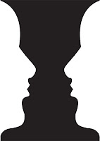
Figure- when two pieces of a design that are different blend together to create a tricky visual image

Proportion- the ratio in size between two different elements in the design

Repetition- when something is easy repeated over again

Rhythm- visual beat
Unity- when more than 1 element of design come together as a whole
Friday, November 18, 2011
Review Week 14
Devry University- Alpharetta, Duluth, Atlanta, Stockbridge, and Decatur. AP Digital Studio Art, Introduction to Graphic Design.
The Art Institutes- Atlanta and Decatur. AP Digital Studio Art, Intro to Graphic Design
Platt College- San Diego. AP Digital Studio Art, Intro to Graphic Design
Full Sail University- Winter Park, Orlando. Nothing, just take the online course
What is a portfolio?
A portfolio is something that you keep all of your work in.
What is the importance of a portfolio?
So your stuff won't get lost
Friday, November 11, 2011
Stephen Kroninger
What kind of art/design does he produce?He cuts up images and collages.
In what publications/media studios has his work been featured?
The Museum of Modern Art
Post 2 samples of his art. Answer the following questions for each piece...
Was this piece published? Where?Yes, on anthropomorphe.com
What principles of design were utilized within the piece? How?Balance, contrast, gradiation
What elements of design were utilized?
All of the elements

Was this piece published? Where?
Yes, in time magazine
What principles of design were utilized within the piece?
Balance, contrast, gradiation
What elements were utilized?
All of them
In what publications/media studios has his work been featured?
The Museum of Modern Art
Post 2 samples of his art. Answer the following questions for each piece...
Was this piece published? Where?Yes, on anthropomorphe.com
What principles of design were utilized within the piece? How?Balance, contrast, gradiation
What elements of design were utilized?
All of the elements
Was this piece published? Where?
Yes, in time magazine
What principles of design were utilized within the piece?
Balance, contrast, gradiation
What elements were utilized?
All of them
Review Week 12
How can you, as the designer, use principles of design to help compose a page?You can use it by doing creative backgrounds and foregrounds
What are the principles of design (define each in your own words)?
Balance- the way two or more images even out
Gradiation- how deep a color or shade of color is tinted in
Repitition- repeating the same thing
Contrast- the way opposing elements are put together
What are the principles of design (define each in your own words)?
Balance- the way two or more images even out
Gradiation- how deep a color or shade of color is tinted in
Repitition- repeating the same thing
Contrast- the way opposing elements are put together
Wednesday, November 2, 2011
Podcast #3 Principles of Design
Define principles of design?Concepts used to arrange the structural elements of a composition
What do the principles of design affect?The message of the work
What is the principle of repetition?Repeating some aspect of the design throughout the entire document.
Describe ways that the principle of repetition helps the composition/audience?It controls the reader's eye and helps keep their attention on the piece.
What are ways that you can incorporate repetition into your designs?Bold font, thick line, certain bullet, color, design element, particular format, spatial relationship
What should you avoid when working with repetition?Repeating to much
What is the principle of proportion/scale?The relative size and scale of the carious elements in a design
What is the most universal standard of measure when judging size?The human body
How can the principle of proportion/scale be used as an attention getter?An unusual or unexpected scale
What is the principle of balance?Distribution of heavy and light elements on the page
Which kinds of elements/shapes visually weigh heavier/greater?Size, shape, and tone
What is another name for symmetrical balance?Formal balance
Define symmetrical balance?Occurs when the weight of a composition is evenly distributed around a central vertical or horizontal axis.
What is another name for asymmetrical balance?Informal balance
Define asymmetrical balance?Occurs when the weight of a composition is not evenly distributed around the axis.
What is the principle of emphasis?The stressing of a particular area of focus rather than the maze of details of equal importance.
What happens to a design that has no focus?Nothing stands out.
What is a focal point and how is it created?A center of interest
How many components of a composition can be a focal point?No more than one
What ways can emphasis be created in a design?Contrasting the primary element with it's subordinate
What is the principle of unity?The wholeness of composition
What three ways can unity be obtained?
1. Put objects close to one another
2. Make things similar
3. Direct vision by a line that travels around the design
What is the principle of variety?Pertains to differences and diversity
What ways can a designer add variety to a design?Vary text, color, and shapes, and alter their contrast, tone, & intensity
Why is it important to find the right balance between unity and variety?Too much unity can be boring, but too much variety can be chaotic
What is figure?The part of a composition that we pay attention to
What is another name for figure?Positive space
What is ground?The surrounding are around the figure
What is another name for ground?Negative space
When a composition is abstract (has no recognizable subject) what will the figure depend on? What does that mean?It will depend on the ground
Why must a designer consider the composition as a whole?
Because the figure/ground relationship is so important
What is the principle of rhythm?
Continuity, recurrence, or organized movement in space and time How is rhythm achieved?Through the orderly repetition of any element, line, shape, value, or texture
What three ways can rhythm occur in a design?
1. When elements themselves are similar in size
2. With a more organic, flowing, sense of movement
3. A sequence of shapes through a progression of steps
How does rhythm help a composition/design?It can add interaction to an otherwise inanimate page layout
What is the principle of contrast?Occurs when two related elements are different
How can contrast help a design?Can draw the viewer's eye into the piece and help guide the viewer through it
What is wrong with having too much or too little contrast in a design?Too much can be confusing, but too little can become boring
What is the key to working with contrast?To make sure the differences are obvious
What are some common ways of creating contrast?
Creating differences in size, value, color, type, texture, shape, alignment, direction, and movement
Friday, October 21, 2011
Andy Warhol
Within what art genre did Warhol work?
He did pop art.
Define the genre?
Art that has to deal with famous people. It is also very freestyle.
During what years was he alive?
From 1928 to 1987.

Title of the piece?
Grevy's Zebra
Describe the color that he utilizes. Does he use any particular color scheme?
He uses a bunch of colors but no specific scheme.
What do you notice about the artwork itself?
I notice that it is very creative.

Title of the piece?
Marilyn.
Describe the color that he utilizes. Does he use any particular color scheme?
There is a bunch of bright colors and a few dark ones.
What do you notice about the artwork itself?
I notice that this piece of artwork is a painting of Marilyn Monroe.
He did pop art.
Define the genre?
Art that has to deal with famous people. It is also very freestyle.
During what years was he alive?
From 1928 to 1987.
Title of the piece?
Grevy's Zebra
Describe the color that he utilizes. Does he use any particular color scheme?
He uses a bunch of colors but no specific scheme.
What do you notice about the artwork itself?
I notice that it is very creative.
Title of the piece?
Marilyn.
Describe the color that he utilizes. Does he use any particular color scheme?
There is a bunch of bright colors and a few dark ones.
What do you notice about the artwork itself?
I notice that this piece of artwork is a painting of Marilyn Monroe.
Color Schemes
 This color scheme is triadic.
 This color scheme is analogous.
 This color scheme is monochromatic.
 This color scheme is complementary.
 This color scheme is split-complementary.
Friday, October 14, 2011
Review Week 9
Compare and contrast vector graphics and pixel images.
Pixel images are usually tiny dots and become blurrier when u increase the size. Vector graphics are just lines that seem smooth when they are increased.
What resolution is necessary to print raster images?
300 dpi.
What resolution is necessary to display raster images on the internet?
72 dpi.
Pixel images are usually tiny dots and become blurrier when u increase the size. Vector graphics are just lines that seem smooth when they are increased.
What resolution is necessary to print raster images?
300 dpi.
What resolution is necessary to display raster images on the internet?
72 dpi.
Friday, October 7, 2011
Steve Jobs
Who is Steve Jobs?
One of the co-founders of Apple
What company was he CEO for many years?
Apple
What did he do for the computer industry?
He expanded it greatly.
How did this man impact the graphic design industry?
He pretty much gave us the computers we use to create these designs.
One of the co-founders of Apple
What company was he CEO for many years?
Apple
What did he do for the computer industry?
He expanded it greatly.
How did this man impact the graphic design industry?
He pretty much gave us the computers we use to create these designs.
Review Week 8
Why must designers pay close attention to how color is utilized within a composition?
So they know how much color to add to the design
Why is the color wheel an important tool for graphic designers?
Because it can show how much of a certain color you would want
We see the color of an object by white and black lights reflecting off objects to give it colors that we see to our eye, even though they aren't really there.
Monday, October 3, 2011
Podcast #2 Color Theory
The right use of color can do what?
Maximize productivity, minimize visual fatigue, and relax the body
Within the electromagnetic spectrum, which waves allow us to see color?
Visible light
Visible light
Describe white light?
Equal parts of all colors in a visible spectrum
How do we see color if objects "have no color of their own"?
They absorb or reflect colors in the visible spectrum
They absorb or reflect colors in the visible spectrum
What is a glass prism?
Transparent triangular object that breaks white light into all the colors of the visible light spectrum
Transparent triangular object that breaks white light into all the colors of the visible light spectrum
What seven colors result when white light is refracted through a prism?
Red, orange, yellow, green, blue, indigo, violet
Red, orange, yellow, green, blue, indigo, violet
Describe hue?
The color itself
The color itself
When does white light occur?
When all wavelengths are reflected back to your eye
When all wavelengths are reflected back to your eye
When does black light occur?
When no light is reflected back to your eye
When no light is reflected back to your eye
How color is perceived depends on what?
Depending on the type of light it is seen with
Depending on the type of light it is seen with
What is a color wheel?
A visual tool that shows the relationship between primary, secondary, and tertiary colors
A visual tool that shows the relationship between primary, secondary, and tertiary colors
What are primary colors? Name them?
Red, yellow, blue
Red, yellow, blue
What are secondary colors? Name them?
Green, orange, purple
What are tertiary colors? Name them?
Red-orange, blue-violet, yellow-green
Red-orange, blue-violet, yellow-green
What are neutral colors? How can they be created?
Black, white, brown, and grey
Black, white, brown, and grey
How can a neutral color help a design?
Help put the focus on other colors or serve to tone down overpowering colors
Help put the focus on other colors or serve to tone down overpowering colors
What are complementary colors? Name them?
Colors positioned opposite of each other on the color wheel. Red& green, orange& blue, and yellow& violet
Colors positioned opposite of each other on the color wheel. Red& green, orange& blue, and yellow& violet
What is color value?
Lightness and darkness of a hue
Lightness and darkness of a hue
What is a shade?
When you add black to a hue so it creates a low-value color
What is a tint?
When you add white to a hue so it creates a high-value color
When you add white to a hue so it creates a high-value color
What is saturation/intensity?
The brightness of a color
The brightness of a color
What happens when you mix complementary colors together?
You produce a dull tone
You produce a dull tone
Describe color harmony?
Something pleasing to the eye
Something pleasing to the eye
What is a color scheme?
Harmonious color combinations
Harmonious color combinations
Describe a monochromatic color scheme?
Uses tints and shades of one color, clean and elegant, and easy on the eyes
Uses tints and shades of one color, clean and elegant, and easy on the eyes
Describe an analogous color scheme?
Uses 3 colors adjacent to each other on the color wheel, one color is used as a dominant color while others enrich the scheme, often found in nature and pleasing to the eye, can accommodate changing moods
Describe a complementary color scheme?
Uses 2 colors opposite each other on the color wheel, will draw lots of attention, and works best in situations where you need high-contrast compositions
Uses 2 colors opposite each other on the color wheel, will draw lots of attention, and works best in situations where you need high-contrast compositions
Describe a split-complementary color scheme?
Uses 3 colors 1 plus 2 adjacent to its compliment and will draw attention but without the tension of complementary scheme
Uses 3 colors 1 plus 2 adjacent to its compliment and will draw attention but without the tension of complementary scheme
Describe a triadic color scheme?
Uses 3 colors equally spaced around the color wheel and offers a strong visual balance
Uses 3 colors equally spaced around the color wheel and offers a strong visual balance
What colors are considered to be warm colors?
Red, yellow, and orange
Describe a warm color scheme?
Bold and energetic
What colors are considered to be cool colors?
Blue, violet, and green
Blue, violet, and green
Describe a cool color scheme?
Gives an impression of calm
Gives an impression of calm
Why is important to consider which colors are being used within a design?
Because it will make it more exciting.
Friday, September 30, 2011
Review Week 6
What is the pen tool used for?
It is used to trace out objects from the internet.
You can manipulate a line by using the white arrow tool and changing it.
How can you utilize the layers palette in Illustrator?
You utilize it by clicking on it then a thing will pop out and you do stuff with it based off of that.
How can you create a clipping mask in Adobe Illustrator?
I honestly have no clue.
Friday, September 23, 2011
Review Week 5

This represents shape. It is a converted oval. Also, there is a blue circle in the middle. This is why it shows shape.

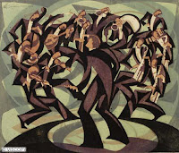
This represents line. It is all made of lines. Also, some of the lines are connected. This is why it shows line.

This represents texture. It is made to look rough. That's why it is bricks. This is why it shows texture.

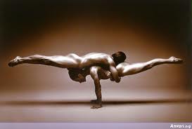
This represents space. There is room between each person. Also, nothing is connected. This is why it shows space.

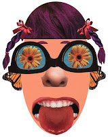
This represents value. There is different shades of each color in the background. Also, some are really bright. This is why it represents value.
Review Week 4
Why/how can icons be used to communicate?
By representing something
What is the difference between copyright and public domain?
Copyright is a right or patent to something public domain is not following the right or patent but it's not illegal
How can you avoid plagairism in this class? In other classes?
Don't ever copy something down word for word and don't switch the words around
Thursday, September 15, 2011
Review Week 3
What is the OHSA? Occupational Safety and Health Administration
How can graphic designers effectively communicate? They communicate by using a computer
Understanding the history, culture and movements of fine and graphic arts will make you a better producer of visual messages. Why? It will make you have a true and better understanding of graphic design.
Understanding the history, culture and movements of fine and graphic arts will make you a better producer of visual messages. Why? It will make you have a true and better understanding of graphic design.
Podcast #1 Elements of Design
What does it take to create good graphic design?
It requires an understanding of the elements and principles of graphic design
What is the difference between elements and principles?
Principles say how you are supposed to design your elements
Name the six (6) elements of design.
Line, shape, space, texture, value, and color
What can lines aid in, when alone or combined with other lines or shapes?
In readability, appearance, and message of a design
Which lines suggest a feeling of rest? Why do you think?
Horizontal because it is in relation to gravity
Vertical lines communicate a feeling of what? Why do you think?
Loftliness because they go up.
What lines suggest a feeling of movement? Why do you think?
Diagonal because they are unstable
Soft, shallow curved lines suggest what? Why do you think?
Comfort, safety, and relaxation because they suggest cofusion
These lines suggest confusion and turbulence? Why do you think?
Curve lines because of their shape and form
What element defines a specific area of space?
shape
What is the difference between two dimensional shapes and three dimensional shapes?
3D has depth as well as width and height
Describe the difference between geometric shapes and organic shapes?
Geometric are structured often symmetrical shapes, while organic are found in nature
What are abstract shapes?
Abstract are stylized or simplified versions of natural shapes
Which basic shape projects an attitude of honesty or equality?
square
What do triangles suggest?
action
Circles convey feelings of what?
Feelings of protection or infinity
Describe positive space and negative space?
Positive refers to the object and elements used in design
Negative refers to the shapes around and between those objects & elements
What is texture?
Texture can refer to the actual surface of a design with the reader actually being able to feel the texture of the paper and materials in the printed design.
Incorporating texture into a design can help do what?
It will help create a feeling of richness and depth
What is value?
Value is the degree of light and dark in a design, it is the contrast between black and white and all the tones in between.
What is another name for value?
Tone
What can the element of color do when incorporated into a design?
It can create images, attract attention, and identify objects
Tuesday, September 6, 2011
Intro Goals
I took this class because I thought it would be interesting. My goal is to pass and to learn new things.
Subscribe to:
Comments (Atom)