James Cloud's Portfolio
Thursday, December 15, 2011
Semester Reflection
In this past semester, I have learned how to make designs on the computer. This is done by using such programs as Adobe Illustrator and Photoshop. One change I would like to happen by next semester is to be out of this class to be honest.
Friday, December 9, 2011
Review Week 17
WHO SHOT THE SERIF?
I have learned that there are many types of serifs,but there are two main types: adnate and abrupt. Adnate is organic, while abrupt is rigid and square.
I have learned that there are many types of serifs,but there are two main types: adnate and abrupt. Adnate is organic, while abrupt is rigid and square.
Tuesday, November 29, 2011
Podcast #4 Typography
Define typography?The art of expressing ideas through the selection of appropriate typefaces.
Where did the word "typography" originate from?
It comes from the Greek words of "form" and "writing."
What does typography involve?Creating and modifying type using a variety of illustration techniques.
What is a typeface?Distinctive designs of visual symbols that are used to compose a printed image/design.
What is another term for typeface?Fonts
What is a character?Individual symbols that make up a typeface.
What is type style?Modifications in a typeface
What does type style "create" within a design?Type style create design variety while maintaining the visual style of the typeface.
What is the waist line and what does it indicate?It is the imaginary line drawn at the middle of the characters.
What is a base line and what does it indicate?The imaginary line drawn at the bottom of the characters.
What is an ascender?The part of the character that extends above the waist line.
What is a descender?The part of the character that extends below the base line.
Describe a serif?A smaller line used to finish off a main stroke of a letter, usually at the top and bottom of a character.
How can the size of the typeface be identified?By using point size.
What is a point?The vertical measurement used to identify the size of a typeface. It measures from the top of the ascender to the bottom of the descender.
How many points are in an inch?There are 72 points in an inch.
What is a pica and how many are in an inch?
6 picas in an inch.
How many points are in a pica?
12 points in a pica.
What is body type and where can it be found?Type sizes that range from 4pt through 12pt type. These sizes are found in places where there is a lot of text to be read.
What is the key to selecting appropriate typefaces to be used as body type?
The bigger the typeface the larger the body type.
What is display type and how is it used?Type sizes above 12pt. Typically, these sizes are used to draw attention to a message.
What is reverse type and when would it be used?Consists of white type on a solid black or darker color background. If the text is too small, reverse type can be difficult on the reader's eye. Display type is necessary.
What is a typeface classification?A basic system for classifying typefaces was devised in the 19th century when printers sought to identify a heritage for their own craft.
When was Blackletter invented and how was it used?It was used with the inventions of the printing press in the mid 1400s.
Describer the characteristics of a Blackletter typeface?They resemble the calligraphy of the time and are highly ornamental with elaborate thick to thin strokes.
When was Old Style invented and what was is based on?It was invented in the mid 1400s. It was based on ancient Roman inscriptions and created to replace Blackletter typeface.
Describe the characteristics of an Old Style typeface?They have wedge-shaped, angled serifs and a low contrast of their thick/thin strokes.
When were formal scripts developed?Formal scripts developed formal writings of 17th and 18th century handwriting masters.
When were casual scripts developed?They were developed in the 20th century.
Describe the characteristics of a Script typeface?They should not be used as small body text because its too hard to read.
When was Modern typefaces developed and why?It was developed in the late 18th and 19th centuries as a radical break from traditional typography of the time.
Describe the characteristics of a Modern typeface?They have a sharp contrast between thick and thin strokes and have thin, flat serifs.
How early can Sans Serif typefaces be found? What happened?
In the 5th century but the formal scripts took over
What does "sans serif" mean?
Without serifs
Describe the characteristics of a Sans Serif typeface?
It is totally different from other types of writing and no serif.
When was Slab Serif developed and why?
In the 19th century for advertisement.
Describe the characteristics of a Slab Serif typeface?
A cross from San serif and modern. They are now big and chunky
Describe Decorative typefaces?
Distinct design style
Why were they developed?
So it can have a different type of look
What are they best used for?
Large point sizes
Monday, November 28, 2011
Review Week 13
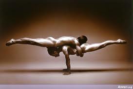
Balance- the way elements are organized into one piece of a design
Contrast- two opposite elements of a design to form one design in total
Emphasis- when you want to show the message in a design
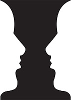
Figure- when two pieces of a design that are different blend together to create a tricky visual image
Proportion- the ratio in size between two different elements in the design
Repetition- when something is easy repeated over again
Rhythm- visual beat
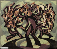
Unity- when more than 1 element of design come together as a whole
Friday, November 18, 2011
Review Week 14
Devry University- Alpharetta, Duluth, Atlanta, Stockbridge, and Decatur. AP Digital Studio Art, Introduction to Graphic Design.
The Art Institutes- Atlanta and Decatur. AP Digital Studio Art, Intro to Graphic Design
Platt College- San Diego. AP Digital Studio Art, Intro to Graphic Design
Full Sail University- Winter Park, Orlando. Nothing, just take the online course
What is a portfolio?
A portfolio is something that you keep all of your work in.
What is the importance of a portfolio?
So your stuff won't get lost
Friday, November 11, 2011
Stephen Kroninger
What kind of art/design does he produce?He cuts up images and collages.
In what publications/media studios has his work been featured?
The Museum of Modern Art
Post 2 samples of his art. Answer the following questions for each piece...

Was this piece published? Where?Yes, on anthropomorphe.com
What principles of design were utilized within the piece? How?Balance, contrast, gradiation
What elements of design were utilized?
All of the elements

Was this piece published? Where?
Yes, in time magazine
What principles of design were utilized within the piece?
Balance, contrast, gradiation
What elements were utilized?
All of them
In what publications/media studios has his work been featured?
The Museum of Modern Art
Post 2 samples of his art. Answer the following questions for each piece...

Was this piece published? Where?Yes, on anthropomorphe.com
What principles of design were utilized within the piece? How?Balance, contrast, gradiation
What elements of design were utilized?
All of the elements
Was this piece published? Where?
Yes, in time magazine
What principles of design were utilized within the piece?
Balance, contrast, gradiation
What elements were utilized?
All of them
Review Week 12
How can you, as the designer, use principles of design to help compose a page?You can use it by doing creative backgrounds and foregrounds
What are the principles of design (define each in your own words)?
Balance- the way two or more images even out
Gradiation- how deep a color or shade of color is tinted in
Repitition- repeating the same thing
Contrast- the way opposing elements are put together
What are the principles of design (define each in your own words)?
Balance- the way two or more images even out
Gradiation- how deep a color or shade of color is tinted in
Repitition- repeating the same thing
Contrast- the way opposing elements are put together
Subscribe to:
Comments (Atom)